Summary
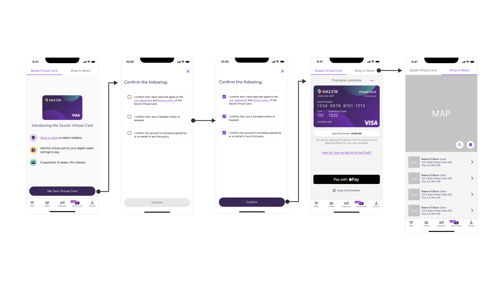
Sezzle needed to comply with updated Canadian regulations for its Virtual Card, requiring users to confirm three key stipulations during the application process. To minimize cognitive load and frustration, I recommended adding just one screen with simple checkboxes and a confirmation button that remained inactive until all steps were completed.
This solution ensured regulatory compliance while keeping the user experience seamless, and Canadian applications for the Virtual Card remained steady post-implementation.
Key Problem
The Sezzle Virtual Card enables shoppers to make in-person purchases at participating stores. Like a credit card, users must apply for the Sezzle Virtual Card, and to continue offering it to Canadian shoppers, Sezzle needed to comply with updated Canadian regulations.
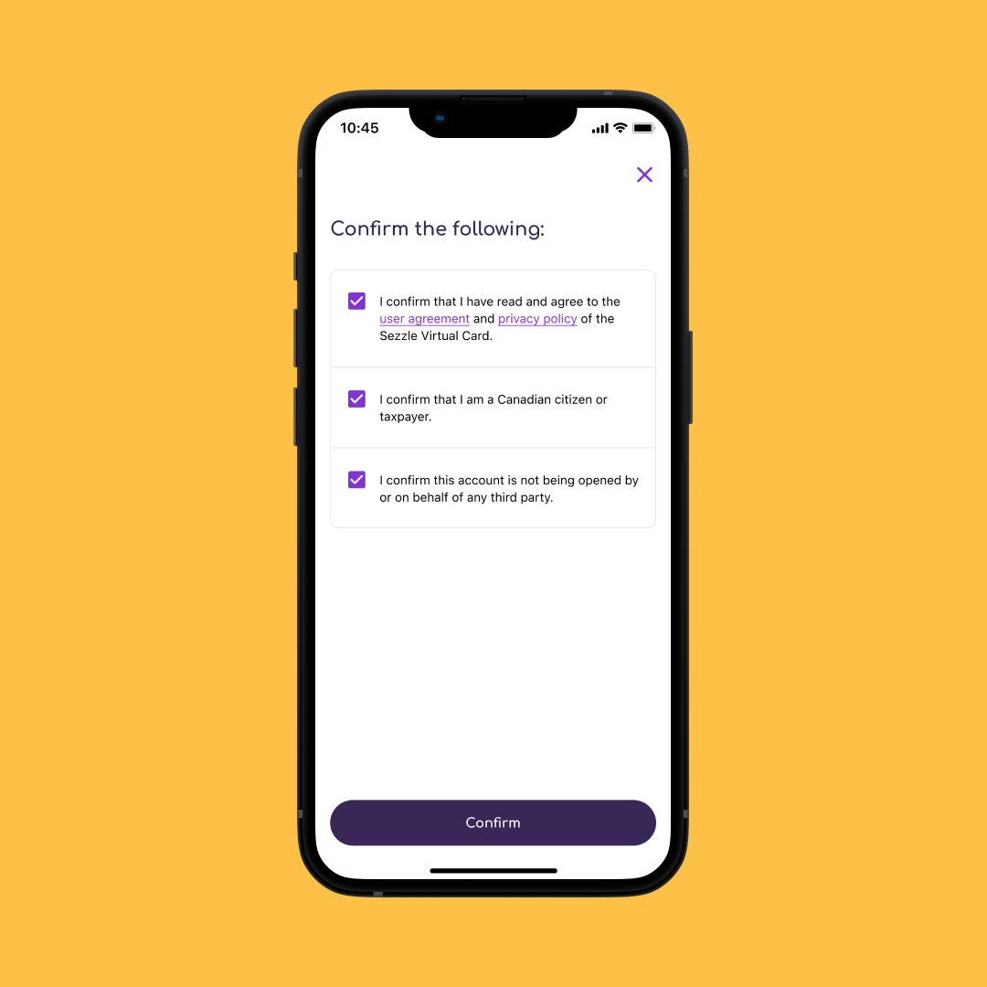
To meet the new requirements, we had to include steps in the flow where Canadian users confirm:
They’ve read the terms and conditions.
They’re a Canadian citizen or taxpayer.
They’re opening the account for themselves, not someone else.
Our challenge was how to integrate these confirmations while maintaining a simple and seamless user experience, especially since many users apply for the card at the point of purchase. How might we meet these new requirements without adding unnecessary complexity or frustration for users?
Discovery
Our discovery phase was streamlined since we already understood the importance of keeping the existing flow as minimal as possible. The focus was on making sure we only included the necessary confirmations and ensuring the language was simple and legally approved. I knew adding more screens could deter some users, so the design needed to be clear, concise, and non-intrusive.
Ideation and Iteration
Through meetings with Product and Legal, we finalized the necessary language for the confirmations. I then focused on designing a user-friendly interface. While exploring various options, including radio buttons, we chose checkboxes for familiarity—since users are accustomed to confirming agreements via checkboxes in digital interfaces.
The key design principle was simplicity. The confirmations were grouped together to show their relevance, but spaced with enough margin to ensure easy readability. I also made sure the confirmation button remained grayed-out until all checkboxes were selected, which provided clarity on what actions were required before proceeding.
Solution
The updated flow for Canadian users added just one screen between the initial request and the final approval for the Virtual Card. The new screen featured three checkboxes, each representing one of the required confirmations. The confirm button would only activate after all three stipulations were acknowledged. This approach minimized cognitive load, kept the flow clean, and ensured compliance with legal standards.
Impact
Stakeholders were pleased with the minimal impact this solution had on the user experience. Applications for the Virtual Card in Canada remained steady, and most importantly, Sezzle was able to continue offering the card to Canadian users by adhering to the updated regulatory requirements.
Specifics
Timeframe Q1-Q2 2023
Tools Figma
Role Product Designer
Collaborators Product Manager, Software Engineer, Legal Team Represenative


