Summary
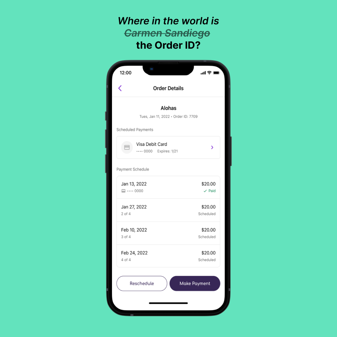
Sezzle shoppers had difficulty locating the Order ID on the Order Details page, causing delays in resolving issues with the Shopper Support team. My solution involved moving the Order ID to the bottom of the page, de-emphasizing it, and grouping it with a "Get help with this order" link to clarify its purpose.
This redesign improved user experience, sped up support interactions, and increased efficiency without requiring more staff.
Key Problem
As a Buy Now, Pay Later company, Sezzle allows shoppers to split payments into four smaller installments over six weeks. Because shoppers often place their orders through the Sezzle app, it’s crucial for Sezzle to communicate key details, such as the order’s merchant, payment schedule, and, importantly, the Order ID. The Order ID is necessary for resolving issues like shipping delays or cancellations, as it allows the Shopper Support team to identify and address the correct order.
The Product department received feedback from the Support team that shoppers struggled to locate the Order ID, delaying issue resolution and increasing frustration. This raised the question: how might we help shoppers more quickly identify the Order ID on the Order Details page without deprioritizing other important purchase information like the merchant, card used, and payment schedule?
Discovery
User interviews confirmed that shoppers were confused about where to find the Order ID. The current location—under the merchant name, on the same line as the transaction date—created friction, which added unnecessary steps to the problem-solving process. Upper management also alerted us that Order IDs could grow from four to sixteen digits as our order volume increased, further complicating the user experience.
Additionally, the solution needed to be quick and easy to implement, as engineering resources were limited. While a full redesign would have been ideal, we had to focus on a small, impactful update that would improve the user experience without straining our “scrappy” team’s capacity.
Ideation and Iteration
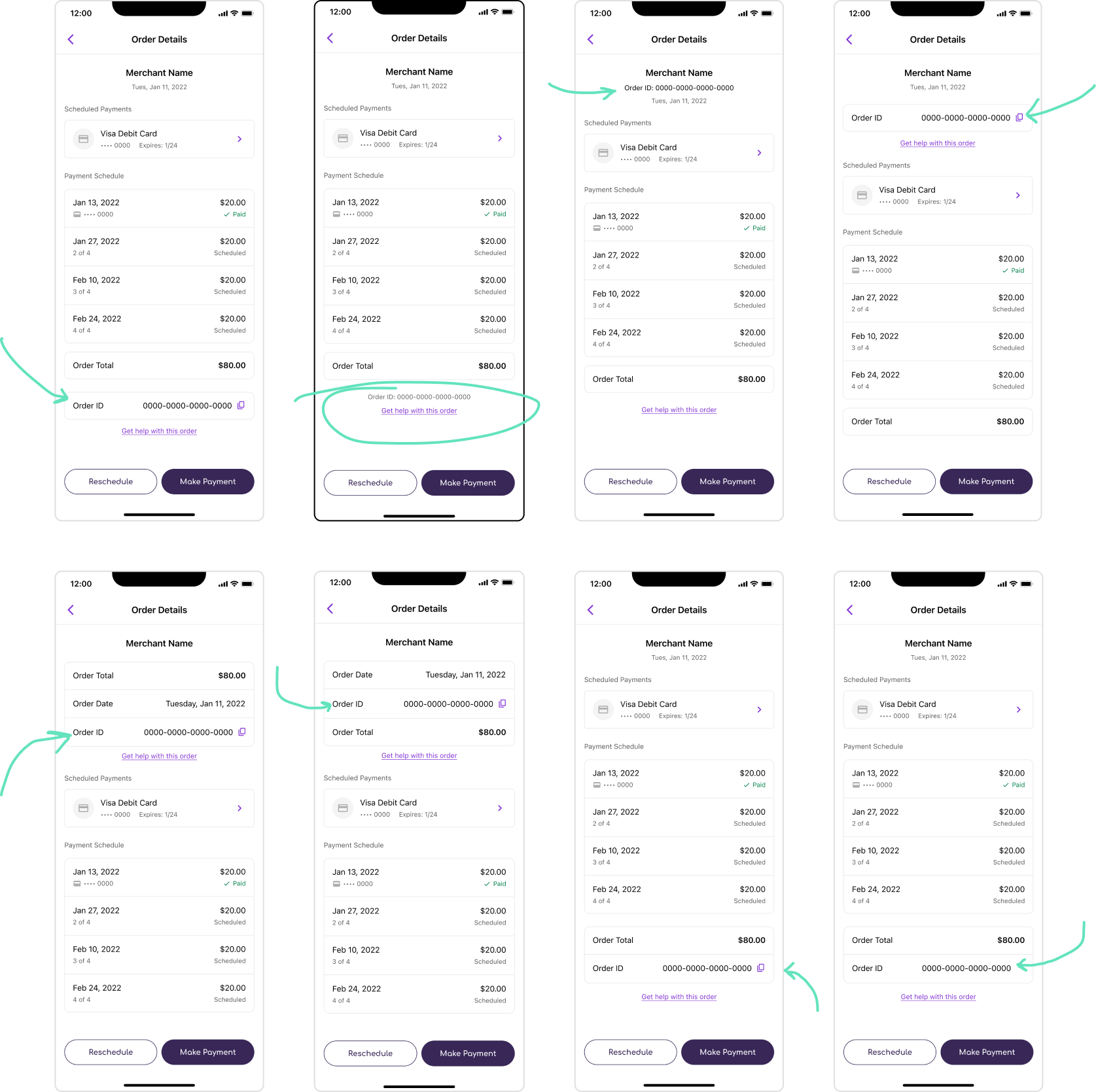
The possibility of a 16-digit Order ID led me to consider how we could reduce cognitive load. I advocated for adding dashes between every four digits to make it easier to read. I also explored different placement options (top vs. bottom), visual emphasis (more subtle or prominent), and grouping (which information it should be paired with).
One option I explored was adding a "copy" function next to the ID, allowing shoppers to quickly copy and paste it when needed. However, due to limited engineering resources, we decided to forgo this feature to prioritize simpler solutions.
Solution
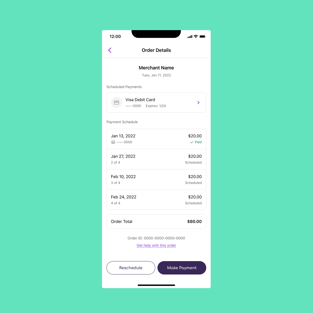
After testing various options, I arrived at the final design:
De-emphasis of the Order ID: Since the ID was likely to grow longer, we decided to avoid large fonts or bold colors that might distract users from more critical information.
Positioning near the bottom of the page: We placed the Order ID below the fold to keep higher-priority information (merchant, payment details) above the fold.
Grouping with a "Get help with this order" link: By pairing the Order ID with the help link, we signaled that the ID is mainly relevant when a user needs support, streamlining the user experience.
The final design successfully balanced the need to display the Order ID while keeping it in the appropriate context, making it easy to find without distracting from other important order details.
Impact
The redesign received positive feedback during user testing. My Product Manager was satisfied with how easy the solution was to implement, and the Shopper Support team reported that they were now able to guide shoppers more effectively by simply directing them to scroll to the bottom of the page. This improvement sped up issue resolution times, allowing the support team to handle more inquiries without requiring Sezzle to hire additional staff.
Specifics
Timeframe Q4 2022 - Q1 2023
Tools Figma, UserTesting.com
Role Product Designer
Collaborators Product Manager, Software Engineer


